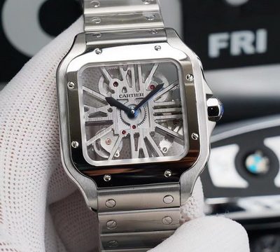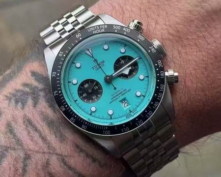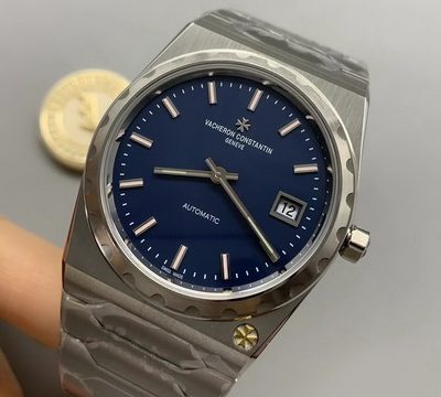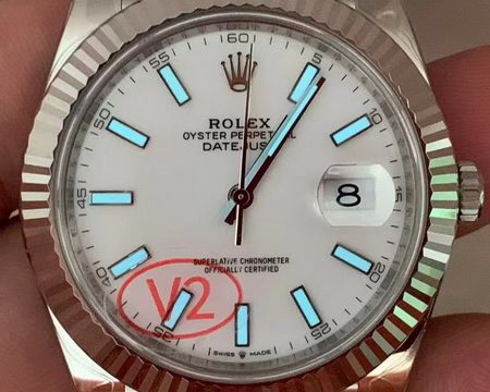

The genuine watch is on the left, and the piece made by ZF Factory is on the right. At social viewing distance, it is hard to tell them apart or judge which one is superior at a glance.

Upon closer magnification, the ZF Factory piece still holds up well. It has nailed the key visual elements that shape the first impression: proportions and contours, satin brushing, light and shadow effects from chamfer polishing, as well as the tapisserie dial, triple sub-dials and marker scales — nearly matching the original.

This angled shot is taken on purpose to show the clarity of the crystal and its reflection control. We can observe whether light passes through cleanly, and check for haze or stray reflections. When this detail is executed properly, the watch achieves that refined aesthetic: bright without glare, clear yet not hollow.

The radial grain on the three sub-dials is fine and uniform, with crisp printed text borders. The hands feature distinct three-dimensional height. To be fair, even when examined under magnification, it is hard for the naked eye to spot obvious differences.

The printing quality of the date wheel on the ZF version is superb. The numerals have full edges and great depth with prominent embossed texture. Both the sharpness of outlines and the control of relief thickness match the genuine watch, delivering a visual experience comparable to the original.

When it comes to the movement, it performs flawlessly at social viewing distance. Only under magnified inspection can minor differences be spotted between the genuine and ZF version in terms of plate finishing, jewel bearing details and rotor colour. In all other aspects including layout, thickness and functional structure, the ZF movement closely matches the original.

Next, let’s look at the AP engraving on the bezel. This detail truly tests craftsmanship. The alignment of lettering, crispness of edges and fineness of the underlying texture all directly shape the visual impression. ZF has executed this part to a high standard, closely following the genuine reference. The engraved lines are clean with sharp boundaries and crisp inner corners, delivering a premium visual effect akin to a sharp-cut finish.

Much of the premium feel of the Royal Oak comes from the geometric facets and surface finishing on the side of the case. It hinges on whether the large satin-brushed areas are clean with consistent grain direction, and if the bright chamfer lines at folded edges and corners are crisp. ZF achieves a high standard here as well. The side lines are sharp, the satin brushing runs smoothly, and the overall visual appearance closely matches the craftsmanship and three-dimensional contours of the genuine watch.

We are examining the precision recessed engraving. The key elements include the proportionality of lettering, edge sharpness and clean sand texture on the base. ZF delivers excellent finishing on these details. The shape of the engraving closely resembles the genuine piece, with deep-set characters, sharp edges and flat bases. The overall process control is executed remarkably well and matches the original watch.